
Basic Viewer User Guide for Analytics
The Basic Viewer Edit Mode is the default mode for all clients with limited self-service capabilities in Analytics. The Basic Viewer Edit Mode enables users to view and interact with an embedded dashboard without having the option to change or create new dashboards.
This guide will detail the Basic Viewer Edit Mode standard dashboards that come out-of-the-box with the Analytics tool, the various metrics that are available in each dashboard, and how to view, change, filter, and edit elements in the dashboards.
Note: For the Basic Viewer Edit Mode, there is no additional setup in Loyalty required to begin using the Analytics tool.
Important: During initial setup for all customers, the Zeta Global onboarding team will designate all users in the Analytics platform as Account-level Admins. This allows you to configure a program setting, Enable Edit Mode for Dashboards, that would enable all users to access the Edit Mode. It is recommended that you use caution in giving such access to your users as Basic Viewer Edit Mode users could update this to Admin Edit Mode and then would have full capability to customize or change dashboards.
Standard Dashboards in Analytics
Out of the box, the initial set of Analytics dashboards for Loyalty includes:
Member Dashboard
The Member Dashboard shows key performance indicators related to the number of member profiles in your current loyalty program and how many profiles are being added over time. It provides insights on how well your loyalty program is doing, if there is steady growth or decline in new members, and what months are the most productive, e.g.
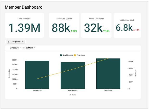
Metrics Defined in the Member Dashboard
- Total Members: The total number of member profiles in the system without additional filters.
- Added Last Quarter: The number of member profiles added in the last 3 months from the current time. Also included is the percentage change in the number of profiles added compared to the previous 3-month period.
- Added Last Month: The number of member profiles added in the last 30 days from the current time. Also included is the percentage change in the number of profiles added compared to the previous 30-day period.
- Added Last Week: The number of member profiles added in the last 7 days up to the current time. Also included is the percentage change in the number of profiles added compared to the previous 7-day period.
- Combination Chart: Displays the trend of new member profiles added over time (by week, month or quarter) and the cumulative number of profiles added in the reporting period.
Viewing the Metrics in the Member Dashboard
Date Range Drop-down
Note that the date range drop-down can be found in the center-left section of the dashboard, as below:
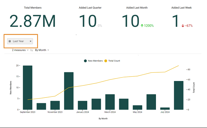
For the combination chart, you have the option of filtering dates for the past week, month, quarter, year, and by a custom range. How to filter date ranges is the same for all time periods.
Custom Range Example
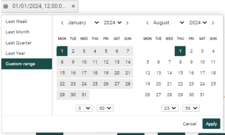
1. Click on the drop-down, then click on Custom range.
2. Select any date range and/or time for the desired custom date range, as in the above example (1 January, 2004 - 31 December, 2009).
3. Click Apply.
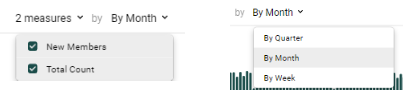
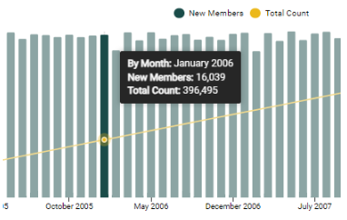
In the combination chart, you can adjust the data displayed by selecting what information you want to see represented on the X and Y axes. In the below example, for the Number of Records drop-down, both New Members and Total Count of Members measures are selected and displayed on the Y axis. Deselect one as desired. For the time period, you can select either By Quarter, By Month, or By Week. This time period will be presented on the X axis.
You can see a summary of the data by hovering over the resulting chart data. Doing so reveals that during January 2006, the new member count was 16,039, and that the total member count was 396,495.
Reports
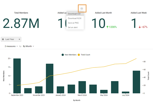
There are useful reports, images, and alerts you can create and download with each metric and chart. The available actions are Download CSV, Download XLSX, Save as PNG, and Set an alert.
Download CSV: After filtering for your desired date range, hover your cursor over the upper right of the desired metric (in the below example, “Added Last Quarter”. Click on Download CSV from the reports drop-down.
The result will be a list, by quarter, of all trending member data.
- Download XLSX: Report data will be the same as with CSV except that it will be displayed in an Excel worksheet.
- Save as PNG: You can create a PNG image of the metric display or chart, useful for presentations and in other reports.
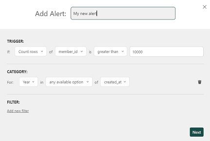
- Set an alert: You can set an alert to check for actual values against set thresholds. Example: If your bounce rate threshold is set at 0.2%, you can set an alert to notify you if the actual bounce rate metric exceeds 0.2%; you will also receive an email to notify.
Note: These report types are available in all standard dashboards.
Time Zone, PNG, and PDF Options
At the bottom right of the dashboard, you may also set the following options:
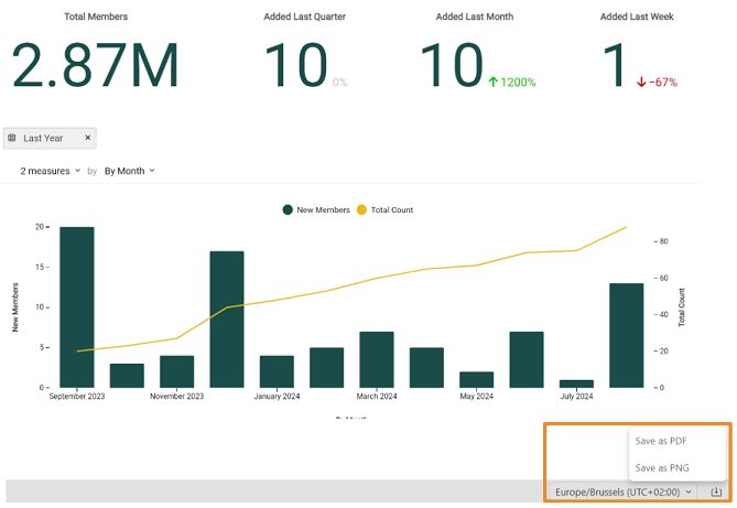
Time Zone: Update for your time zone and location.
Save as PNG: Click on the Save as PNG report from the drop-down to export the entire dashboard as a PNG.
Save as PDF: Click on the Save as PDF report from the drop-down to export the entire dashboard as a PDF.
Note: Time Zone update, Save as PDF, and Save as PNG are available in all standard dashboards.
Actions Drop-down
In the upper-right corner of the dashboard, you can select the following options under the Actions drop-down.
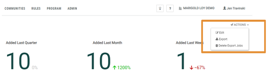
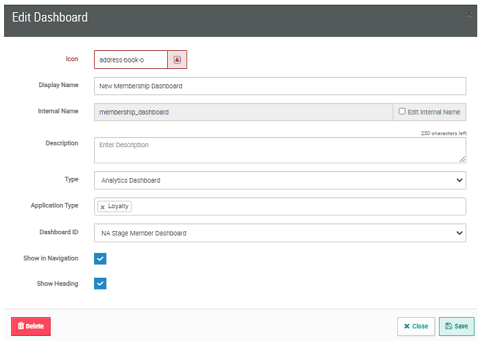
Edit Dashboard: In the Edit Dashboard pop-up, you can update the Display Name, Description, and Dashboard ID. Note that the Type of dashboard, Analytics Dashboard, will already be set up for you by Zeta Global. You can also choose to show the name of the dashboard by clicking on Show Heading.
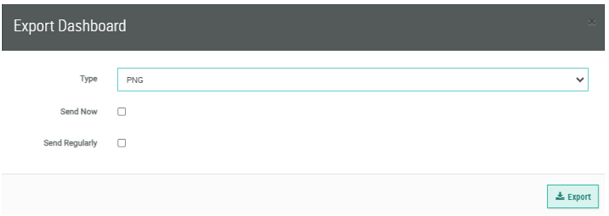
Export: This is another way in which you can export the dashboard to a PNG, PDF, or CSV format. Note that you may either opt to Export now, or you may Export at a scheduled cadence. When configuring the export, you can enable an email notification to a set of designated recipients, and include a custom email message subject line and body.
Delete Export Jobs: Select any export jobs that you would like to delete here.
Note: Edit Dashboard, Export Dashboard, and Delete Export Jobs are available in all standard dashboards.
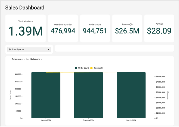
Sales Dashboard
The Sales Dashboard shows key performance indicators related to the number of member orders processed in the program over time and the value of those orders. The Sales Dashboard provides insights on how many of your members are actually buying and how much revenue this is generating, whether there are times when sales boost or slow down, etc.
Metrics Defined in the Sales Dashboard
- Total Members: The total number of member profiles in the system without additional filters.
- Members w/Order: The number of members with at least one order during the specified reporting period.
- Order Count: The count of member orders processed during the reporting period.
- Revenue ($): The sum of order subtotals processed during the reporting period.
- AOV ($): The average order value (AOV) based on member order subtotal divided by the count of orders processed in the reporting period.
- Combination Chart: Displays the trend of member orders in the period with the associated revenue (based on sum of order subtotal).
- Pivot Table: Displays the list of Store locations in the program by Name and Store Id, and the associated order count, revenue, and associated AOV by location.
Viewing the Metrics in the Sales Dashboard
Date Range Drop-down
You have the option of filtering dates for the past week, month, quarter, year, and by a custom range. How to filter date ranges is the same for all time periods.
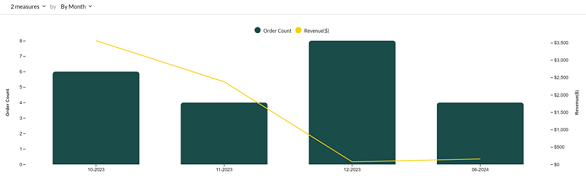
You can adjust the data displayed by selecting what information you want to see represented on the X and Y axes. In the below example, for the Number of Records drop-down, Order Count and Revenue measures are selected and displayed on the Y axis (you can deselect as needed). For the time period, you can select either By Month or By Week. This time period will be presented on the X axis.

See the sections on Reports, Time Zone, PNG, and PDF Options, and Actions Drop-down under Member Dashboard for more information on those dashboard options.
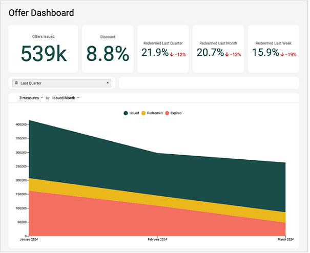
Offer Dashboard
The Offer Dashboard shows key performance indicators related to the number of offers issued in the program over time, the associated discount percentage applied from those offers, and offer redemption rates over time.
Metrics defined in the Offer Dashboard
- Offers Issued: The total number of offers issued based on the count of offer responses in the program.
- Discount: Discount percentage applied across member orders from all offers redeemed in the program.
- Redeemed Last Quarter: The percentage of issued offers that were redeemed in the last 3 months up to the current time. Also included is the percentage change in the offer redemption rate compared to the previous 3-month period.
- Redeemed Last Month: The percentage of issued offers that were redeemed in the last 30 days up to the current time. Also included is the percentage change in the offer redemption rate compared to the previous month.
- Redeemed Last Week: The percentage of issued offers that were redeemed in the last 7 days from the current time. Also included is the percentage change in the offer redemption rate compared to the previous week.
- Combination Chart: Displays the trend of offers issued, offers redeemed, and offers expired in a stacked line format.
Viewing the Metrics in the Offers Dashboard
Date Range Drop-down
You have the option of filtering dates for the past week, month, quarter, year, and by a custom range. How to filter date ranges is the same for all time periods.
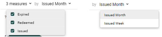
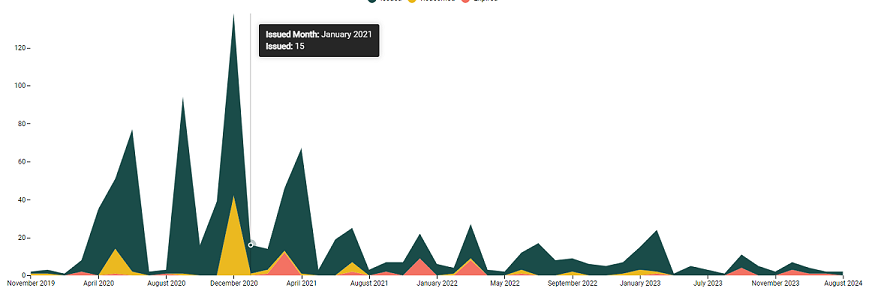
You can adjust the data displayed by selecting what information you want to see represented on the X and Y axes. In the below example, for the Number of Records drop-down, Expired, Redeemed, and Issued Offers measures are selected and displayed on the Y axis. Deselect one or more as desired. For the time period, you can select either By Issued Month or By Issued Week. This time period will be presented on the X axis.
See the sections on Reports, Time Zone, PNG, and PDF Options, and Actions Drop-down under Member Dashboard for more information on those dashboard options.
Program Economy Dashboard
The Program Economy Dashboard shows key performance indicators related to the primary metrics (such as points) earned, redeemed, and expired in the system, and the resulting outstanding balance.
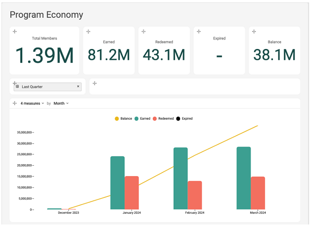
Metrics Defined in the Program Economy Dashboard
- Total Members: The total number of member profiles in the system without additional filters.
- Earned: The sum of the points earned in the reporting period.
- Redeemed: The sum of the points redeemed in the reporting period.
- Expired: The sum of the points expired in the reporting period.
- Balance: The points earned minus the sum redeemed, minus the sum expired in the reporting period (balance = earned - redeemed - expired).
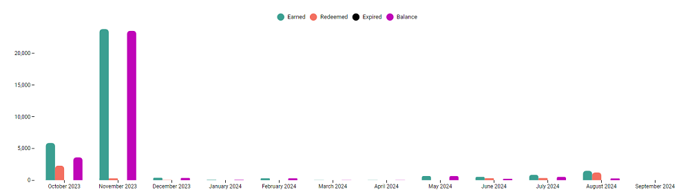
- Combination Chart: Displays the trend of points earned, redeemed and expired in the reporting period, as well as the cumulative point balance in the same period.
Viewing the Metrics in the Program Economy Dashboard
Date Range Drop-down
You have the option of filtering dates for the past week, month, quarter, year, and by a custom range. How to filter date ranges is the same for all time periods.
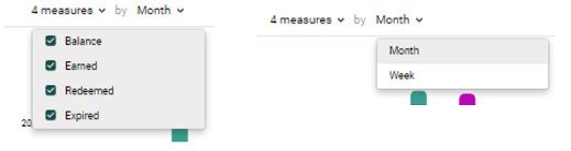
You can adjust the data displayed by selecting what information you want to see represented on the X and Y axes. In the below example, for the Number of Records drop-down, Balance, Earned, Redeemed, and Expired points measures are selected and displayed on the Y axis. Deselect one or several as desired. For the time period, you can select either By Month or By Week. This time period will be presented on the X axis.
See the sections on Reports, Time Zone, PNG, and PDF Options, and Actions Drop-down under Member Dashboard for more information on those dashboard options.
